
SCANDINAVIAN AIRLINES
DESIGN IMPROVEMENTS
FOR A BETTER EXPERIENCE WHEN
BOOKING A TRIP ON THE WEB
When I worked as a Visual Design consultant at SAS, I was responsible for the UI design of the booking and payment flows on the web.
I did a number of different projects. Some are, at the time of writing, implemented. The major part are waiting to be developed and can’t yet be presented.
My last project was to begin a complete redesign of the SAS start page.
This was all between January 2019 and April 2020.
BOOKING FLOW DESIGN UPDATE
THE ASSIGNMENT
The overall goal was to make it easier for the customers to find information and to book the most suitable ticket for their specific needs. Mobile and desktop were equally important.
MY ROLE
I was responsible for the visual design. Throughout the whole project I also had a close cooperation with my dear UX colleague Linn Gaude. We came up with ideas, discussed both UI and UX solutions and did a lot of usability testing together.
THE RESULT
Our work has contributed to a better customer experience, reduced number of calls to customer service and actual business value for SAS. The visual changes have also given a more high quality feel, which is so closely associated with the SAS brand.

WORKING PROCESS / An overview of our process in general.
THE PRODUCT CARDS
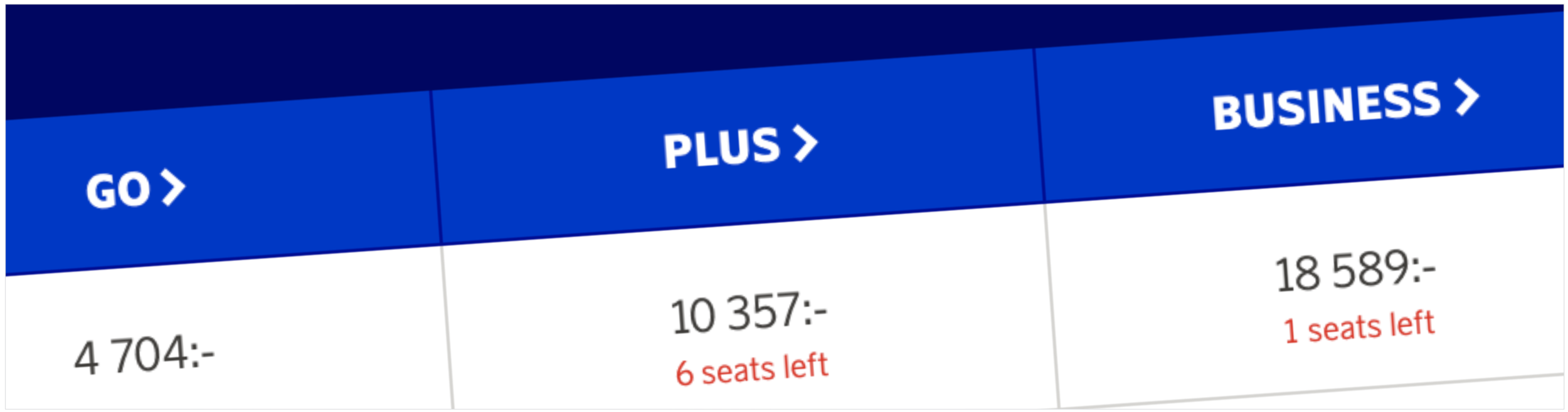
When booking a trip the customer first selects the ”Travel Class” (Go, Plus our Business) in the booking chart. The product cards appear and by selecting one of them the customer gets the desired ”Fare Family”.

NEW DESIGN

OLD DESIGN
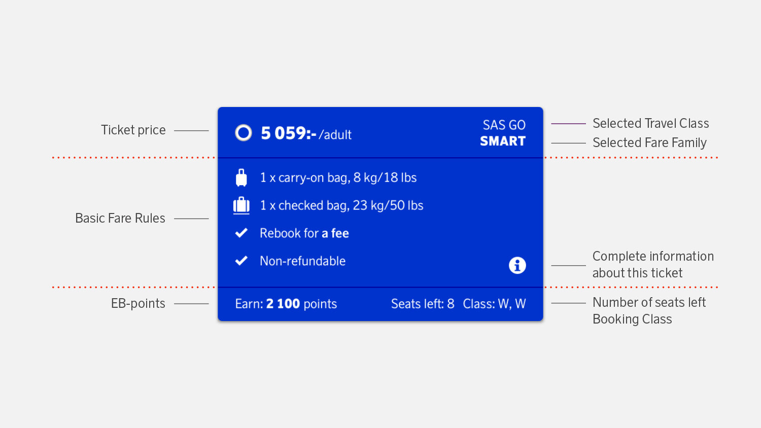
INFORMATION STRUCTURE

CARD VARIATION EXAMPLES
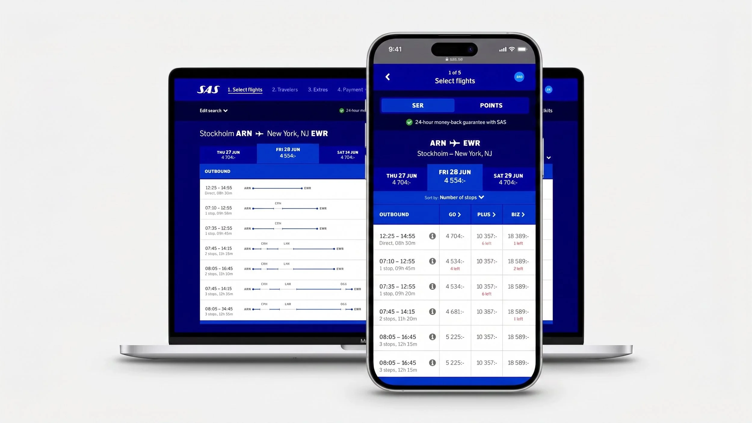
THE BOOKING CHART
Here is where the customer selects the departure time, ”Travel Class” and ”Fare Family” (the cards) for outbound and return trip. There is a lot of information here and it’s important to make the chart clear and easy to scan.
NEW DESIGN
OLD DESIGN
NEW DESIGN
OLD DESIGN
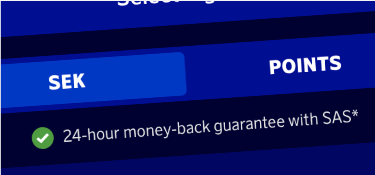
TOP OF PAGE
”24-hour money…” has been added since it’s a great USP for SAS. To separate this part from the rest of the page, it now has a dark blue background.

DESTINATION HEADERS
To make it easier to know what destinations the customers have searched for and which direction they’re looking at, the page now has clear headers.
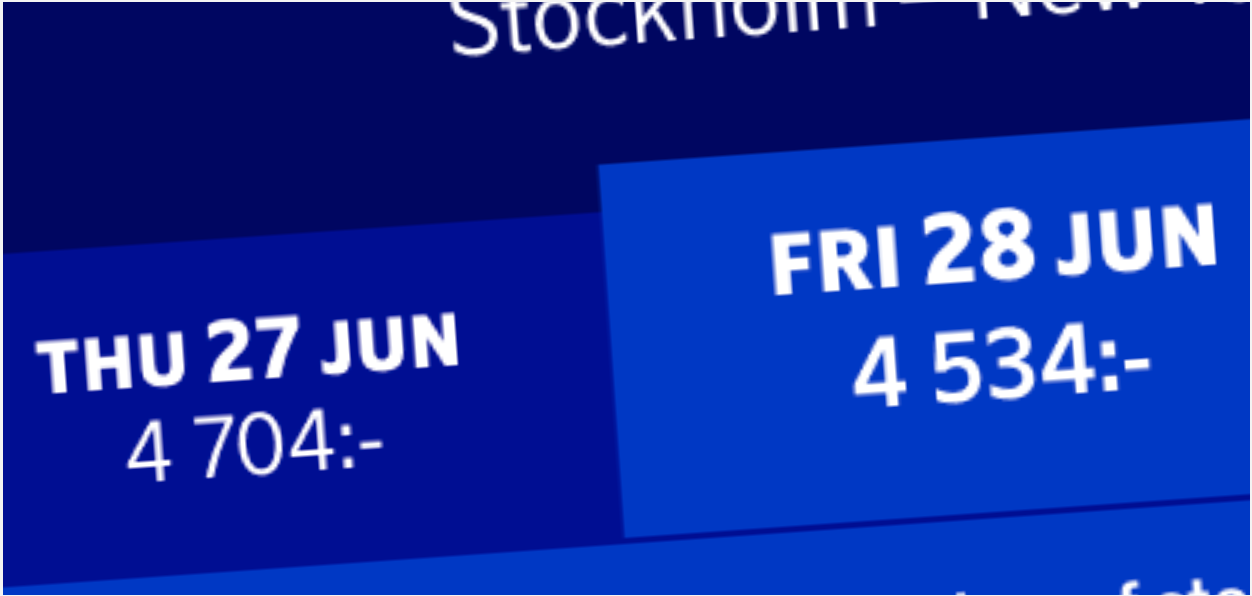
DAYTABS
The numbers of the dates are now slightly bigger than the text. The price of the selected day is bigger and bold. Both to make it easier to quickly scan the information.

SORTING SEARCH
We added the possibility to sort the search between numbers stops, departure time, price etc.
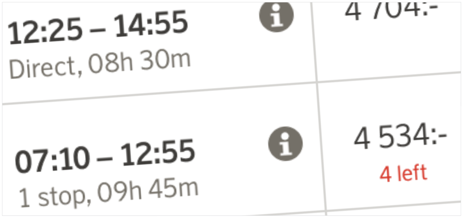
TIME & DURATION
The numbers of the times are bold to highlight them among all other numbers in the chart. Number of stops (or direct), along with duration of the flight have been added on mobile.

CAMPAIGNS & BONUS TRIPS
The chart needed to be designed to sometimes include indicators for reduced prices and bonus trips.
TRAVEL CLASS INFO
To unclutter the chart, we took away the short information about the ”Travel Classes” from the chart. We made the desk top design the same as on mobile. The customer now clicks the ”Travel Class” to see what’s included.
FLIGHT INFO
The ”flight bar” got a visual redesign that will also work better in production. To make it easier to scan, the number of stops and duration was moved from the right and placed under the times.