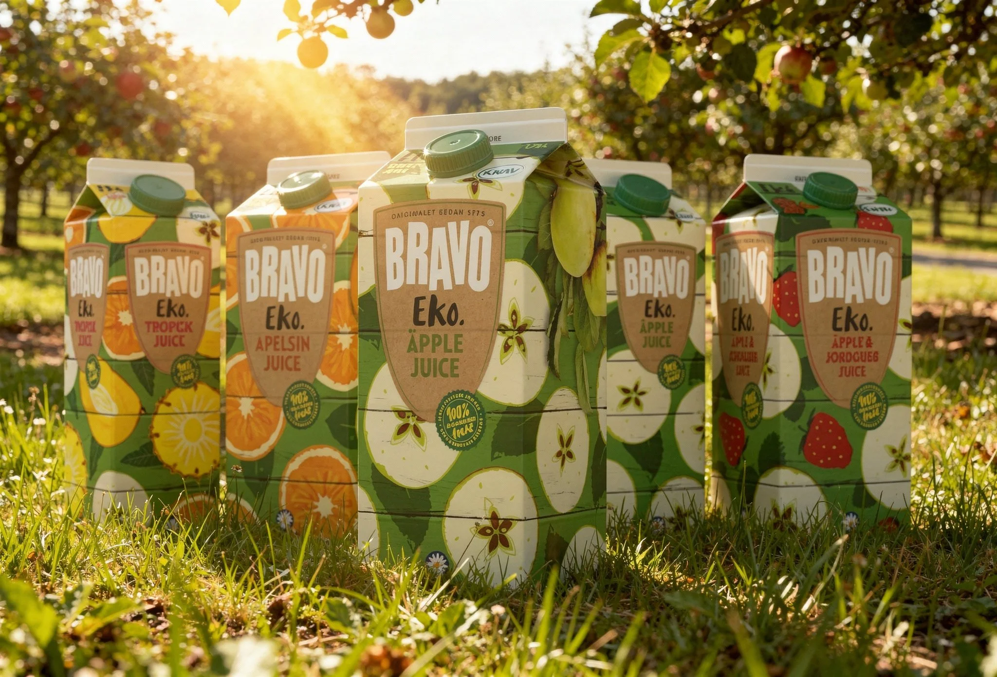

BRAVO EKO
PACKAGING DESIGN
FOR BRAND EXTENSION
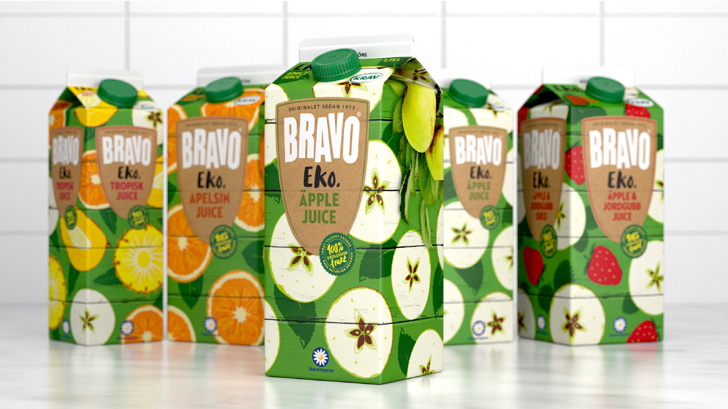
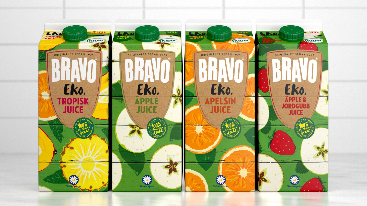
When Bravo launched an organic range, we chose to give the packaging a different look from Bravo’s Original Juices, rather than simply adding an organic badge. That way the whole brand could be strengthened and the products could find new audiences. Bravo’s classic stripes are still there, as wooden planks with playfully painted fruits. I was responsible for the design and illustrations.


Made during my time as Senior Designer Amore Brand Identity.